

Link to Twitter Thread
In Canada, about 5.7% of adults are visually impaired. So we decided to explore how we could make Atila more accessible for all students.
Our mission at Atila is to help democratize financial freedom for education in the BEST way possible. To do that, we pride ourselves on always bettering our website, and creating the best possible experience for our users.
The first step was figuring out how we could make things easier for our users. We started by testing out link colours and realized that the shade of blue we used did not pass the Contrast ratio accessibility test. For average users, an acceptable ratio is 3.0, but for the visually impaired the target ratio is 4.5. We began by inspecting the link colours of our website, and playing around with the colour until it passed both tests.

At first, we slightly made the blue darker (hex code #0072ec). Our thought process was that we didn’t want to give the users a giant culture shock and that this colour of blue was dark enough to meet requirements but also similar enough to the colours that matched the rest of the website. However, we failed to take into account our hover effect. When the user hovers over a link, the link fades to a lighter blue. What we found is that it didn’t even meet the standard colour contrast ratio for those who are not visually impaired.

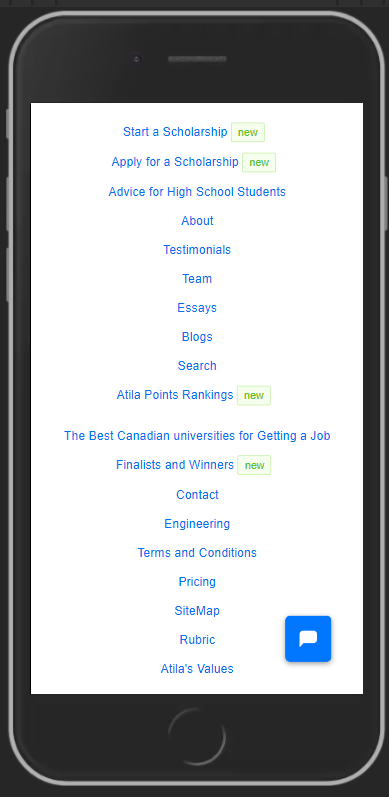
Another issue we found was that certain parts of our website needed a greater requirement for the Contrast Ratio. For example, the footer pictured below needed a contrast ratio of 7.0 to be acceptable for the visually impaired.

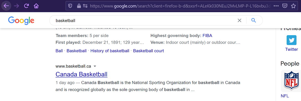
To fix these issues, we decided to draw some inspiration from the tech giant Google. When you hover over a link in a Google search, the page underlines the text that you are hovering over.
So the next step for us was to change our hover from a lighter blue to the same blue with an underline. This way, when a link is highlighted on Atila, the user will get an underline. On top of that, we changed the blue to an even darker shade so that we meet the 7.0 contrast ratio. We ended up using the hex code #0056b3 as the colour for our links.

The site was looking great, it met the Contrast Ratio requirements for all users, and the darker blue fit in nicely with the white background. However, upon further review, we found that our new changes had made the button text go dark blue upon hover as well. The problem with this is that our buttons on the site are blue, so it effectively made the button unreadable.

The final step was to ensure that the button was easy to see and interact with on the website. To do this, we changed the button text colour to white, to ensure that even when hovered over the button text is easy to read with all.

After reviewing the changes, we pushed it to the site where it is now live! We made these changes to our links to ensure that Atila is accessible for everybody and we want users to have the best possible experience when finding funding for school. Having a disability shouldn’t put you at a greater disadvantage, and we understand that and are continuously working towards improvements to our site.
If you have any other suggestions for making our site more accessible, please email info@atila.ca, or tweet or DM us at @atilatech on Instagram and Twitter.
Related

In this article, I take a dive into my Atila internship experience. This includes the culture at Atila, the projects I worked on, my favourite part of the internship, my favourite project, the skills I learned, how I would improve Atila and...

This is about Atila's crypto scholarships

University would be higher quality and more affordable if students are able to attend a home university where they take a minimum of one class and the option take the remaining classes at any other accredited university in the country.